I focus on creating modular icon sets that serve as shortcuts, distilling complex ideas into a clean, simple format that feels both intuitive and completely on-brand.




ROLE: Primary designer and set manager
I had the pleasure of building a library of nearly 300 custom line icons from the ground up for Angie’s List, some of which stayed in the mix during the transition to Angi. It was a rewarding challenge to create a cohesive visual language that felt just right for the brand’s evolving identity.
To get there, I spent time auditing the existing system to make sure we were representing every service category accurately. I focused on finding that perfect balance across the entire set, crafting the designs to look sharp and inviting at any size, from 72px all the way down to 16px.
I had the pleasure of building a library of nearly 300 custom line icons from the ground up for Angie’s List, some of which stayed in the mix during the transition to Angi. It was a rewarding challenge to create a cohesive visual language that felt just right for the brand’s evolving identity. To get there, I spent time auditing the existing system to make sure we were representing every service category accurately. I focused on finding that perfect balance across the entire set, crafting the designs to look sharp and inviting at any size, from 72px all the way down to 16px.


ROLE: Winning designer
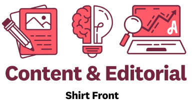
Our content team held an exciting contest to design shirts that represented the entire content and editorial team. Everyone was a free shirt of the winning design.
I leaned into my icon knowledge and created the winning design that represented the three main groups in the department:
Designers & Writers
Leadership & Creativity
Operations & Analytics
It was a creative challenge to get all stakeholders to agree on but I am happiest when my designs meet and exceed expectations. It was also great to see the design come to life off the screen as well.
Our content team held an exciting contest to design shirts that represented the entire content and editorial team. Everyone was a free shirt of the winning design. I leaned into my icon knowledge and created the winning design that represented the three main groups in the department: Designers & Writers Leadership & Creativity Operations & Analytics It was a creative challenge to get all stakeholders to agree on but I am happiest when my designs meet and exceed expectations. It was also great to see the design come to life off the screen as well.

ROLE: Designer and set manager
As the Angi product grew to include other platforms like HomeAdvisor, our team took on the challenge of unifying two different icon styles into one cohesive system. We wanted to make sure that no matter which platform a user was on, the visual language felt consistent and part of the same family.
Once the brand team dialed in the core style for the first batch of icons, I stepped in to scale that design language across the rest of the library. This meant updating every existing icon and several custom designs for the content team, while auditing the whole set to make sure everything stayed on-brand and followed the UX team’s latest guidelines.
It was a massive undertaking that took a lot of focus to get right, but the end result was a total game-changer for our workflow. By creating a single, reliable source of truth, we made things much more efficient for the design team and cut the time spent hunting for or tweaking icons by over 80%.
As the Angi product grew to include other platforms like HomeAdvisor, our team took on the challenge of unifying two different icon styles into one cohesive system. We wanted to make sure that no matter which platform a user was on, the visual language felt consistent and part of the same family. Once the brand team dialed in the core style for the first batch of icons, I stepped in to scale that design language across the rest of the library. This meant updating every existing icon and several custom designs for the content team, while auditing the whole set to make sure everything stayed on-brand and followed the UX team’s latest guidelines. It was a massive undertaking that took a lot of focus to get right, but the end result was a total game-changer for our workflow. By creating a single, reliable source of truth, we made things much more efficient for the design team and cut the time spent hunting for or tweaking icons by over 80% on average.
ROLE: Designer and QA specialist
Beyond the website and mobile app, these icons were a daily staple for the content team’s infographics. Sometimes that meant creating custom icons on the fly to match the set, which I loved because it really let me stretch my creativity to solve new visual puzzles. I also teamed up with other designers to brainstorm ideas and QA’d their work to make sure every custom creation felt like a natural part of our brand language.
Beyond the website and mobile app, these icons were a daily staple for the content team’s infographics. Sometimes that meant creating custom icons on the fly to match the set, which I loved because it really let me stretch my creativity to solve new visual puzzles. I also teamed up with other designers to brainstorm ideas and QA’d their work to make sure every custom creation felt like a natural part of our brand language.


